Rebranding for Dal Ben Spa, an Italian company operating internationally
Written by
Giulia
Corporate identity
Websites and portals
The new positioning is conveyed by a renewed and consistent visual identity across online and offline channels
Who is Dal Ben
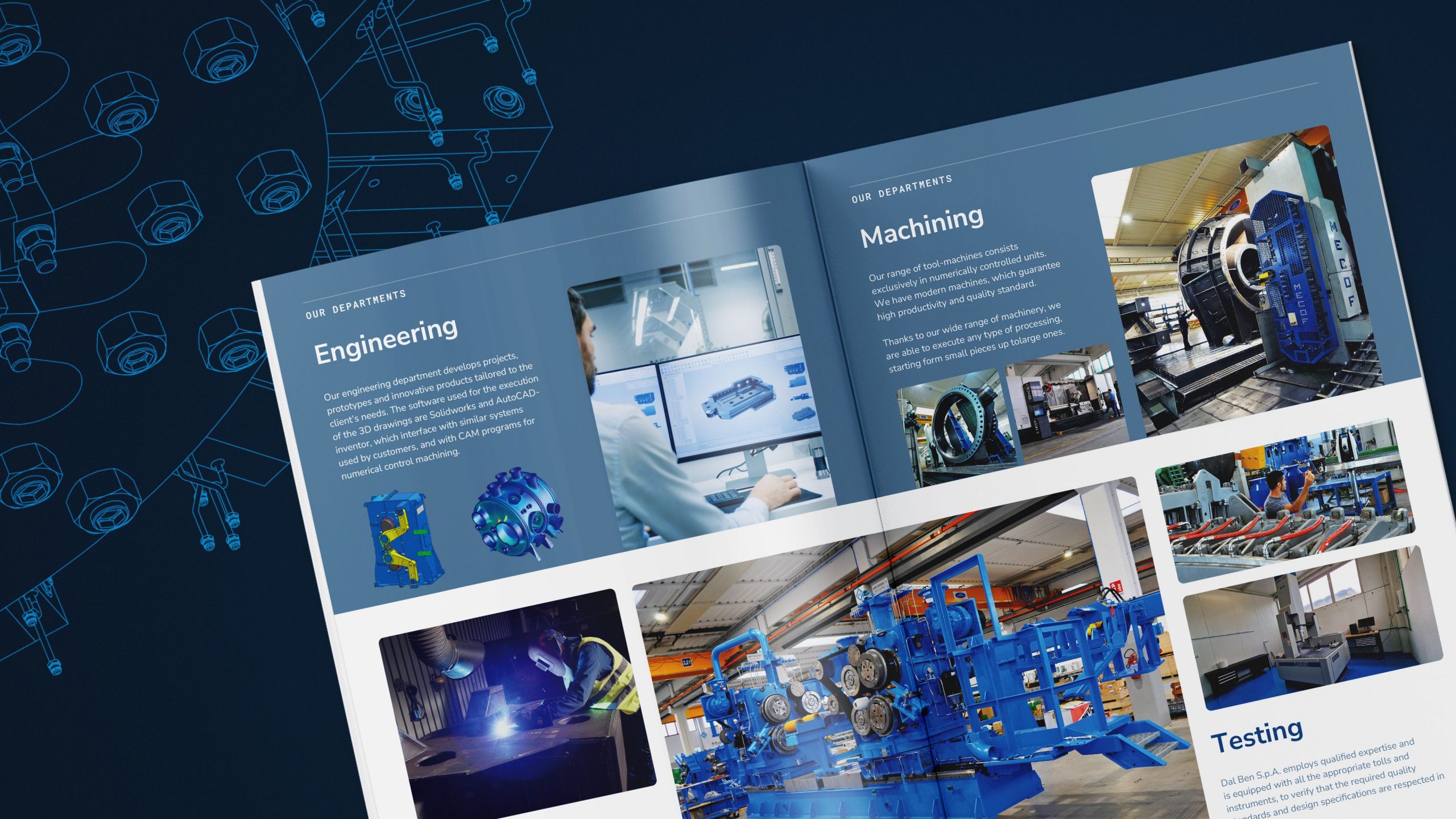
Dal Ben Spa specialises in the design and manufacture of complex machinery and systems for industry. The company works in partnership with its customers, taking a consultative approach. The ideas and needs of companies are thus translated into fully customised technological innovations.
The challenge
A family-run local company, it is currently undergoing a generational change and is looking towards international markets. KeyWe has supported Dal Ben Spa in an ambitious rebranding project to strengthen its position as an international player and technological leader.
The new company slogan
The collaboration between Dal Ben Spa and KeyWe began with the creation of a pay-off. The company requested this new element in its communications to clearly express the direction it was taking.
KeyWe proposed the pay-off ‘Leading vision’. This was chosen in English, as the company operates in international markets. The know-how gained over the years is projected into the future. Today, Dal Ben acts as a guide for companies seeking innovation and wanting to rethink their production possibilities.
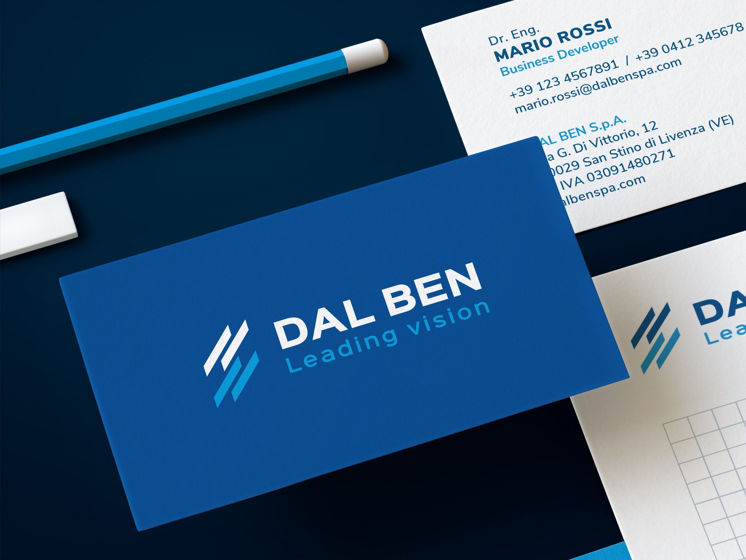
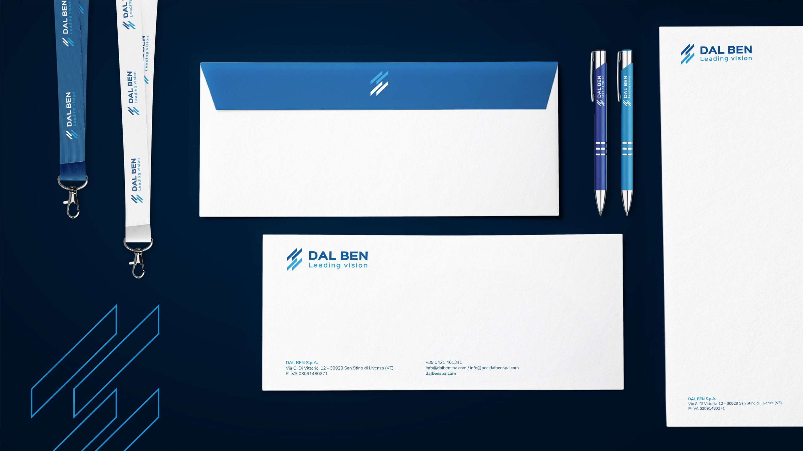
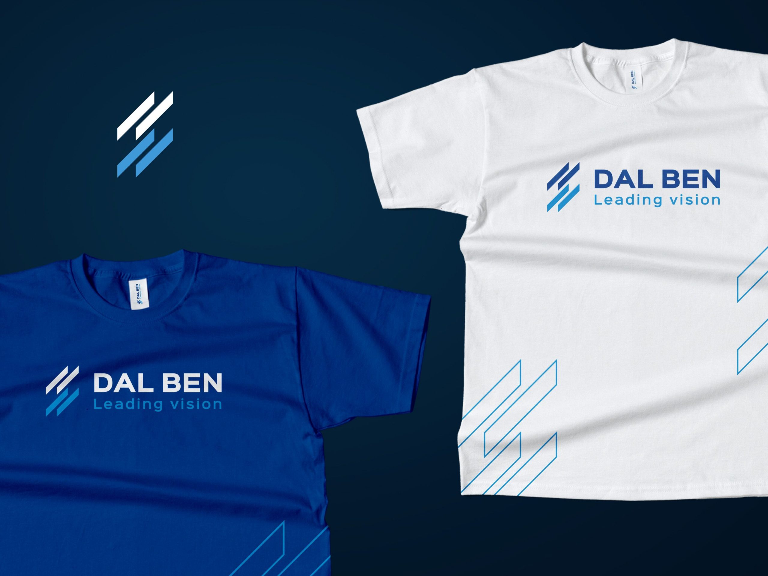
Corporate Identity: logo and coordinated image
New Dal Ben logo
KeyWe designed the new Dal Ben Spa logo. By refining and evolving the existing logo, the company’s history was taken into account and adapted to the new corporate identity. This is particularly noticeable in the pictogram. Oriented upwards, from left to right, it symbolises a focus on the future. It thus represents the direction Dal Ben is pursuing: looking ahead from different points of view. The sans serif typeface is rigorous and highly legible.
Coordinated image
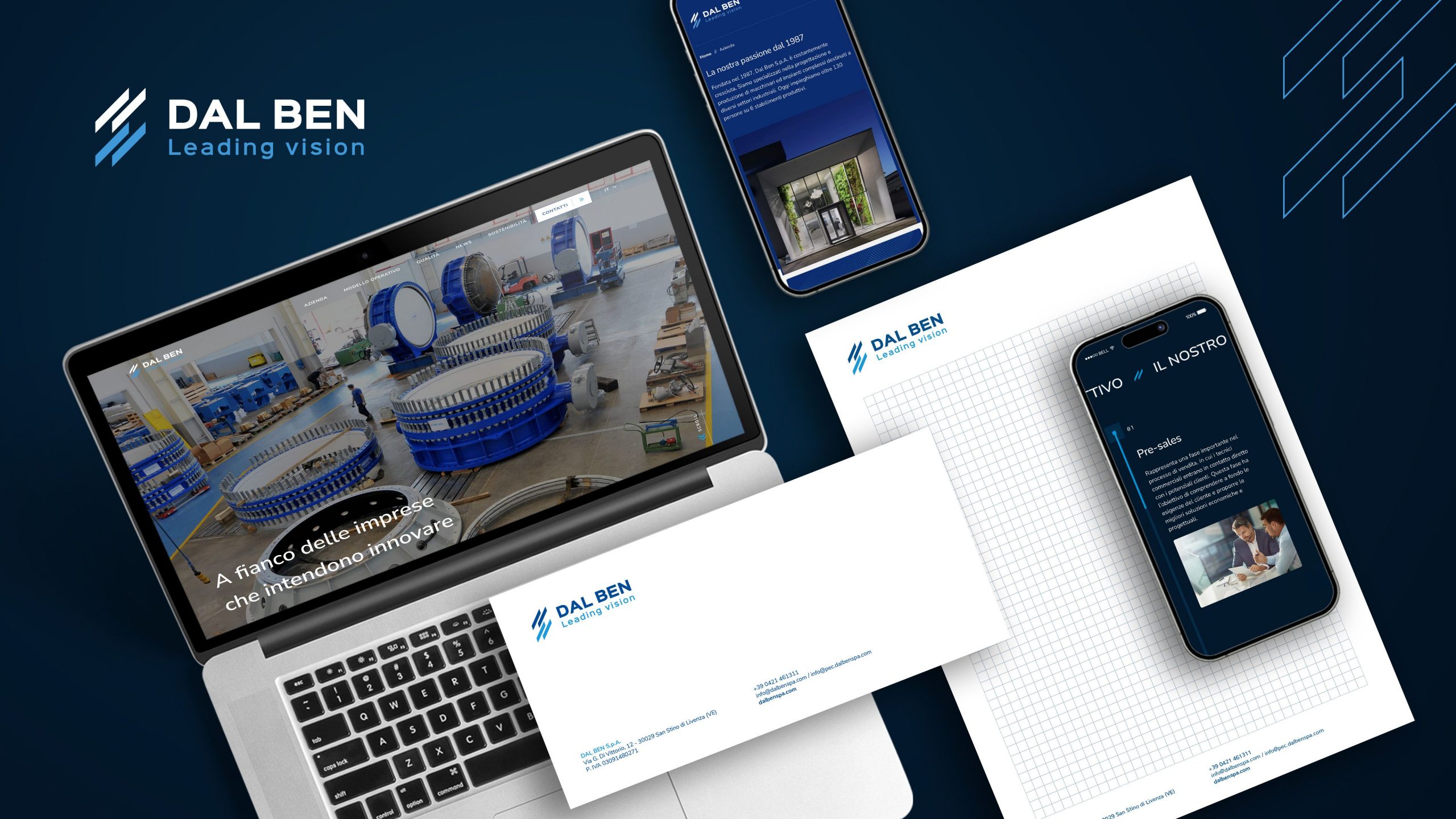
The logo and brand colours are the starting point for defining Dal Ben Spa’s corporate identity. The colour palette includes blue, light blue and grey: colours that speak of technology, engineering and innovation. The logo and identifying colours are therefore found on online and offline communication tools, in perfect identity consistency.
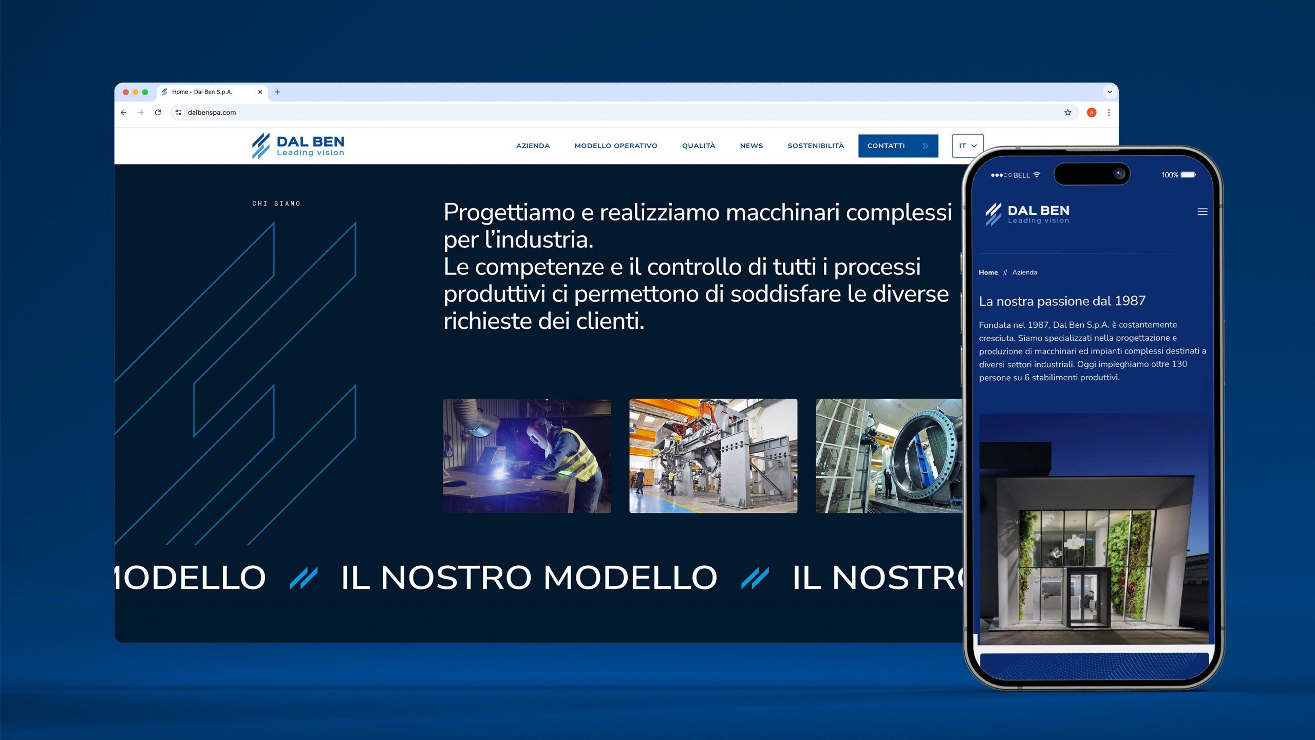
A new website
KeyWe designed Dal Ben Spa’s new website, in line with the corporate identity developed and capable of projecting the company internationally. The navigation structure supports the need to engage and inform companies and institutions, which is why the focus is on the company, its processes and its standards.
The design of the website reflects the technical nature of the company. The colours used are typical of the sector. The sans serif font is legible, rigorous and in keeping with the world of industry and technology. The texts are concise and the tone of voice is professional.
The photos give ample space to the machinery and production areas, illustrating the company’s production capacity. There is no shortage of people, the beating heart of Dal Ben’s innovation and an absolute value for the family-run company.
Browse the new Dal Ben website.
Written by
Giulia