UX/UI Design – Rules VS Creativity
Written by
Giulia
Websites and portals
Corporate identity
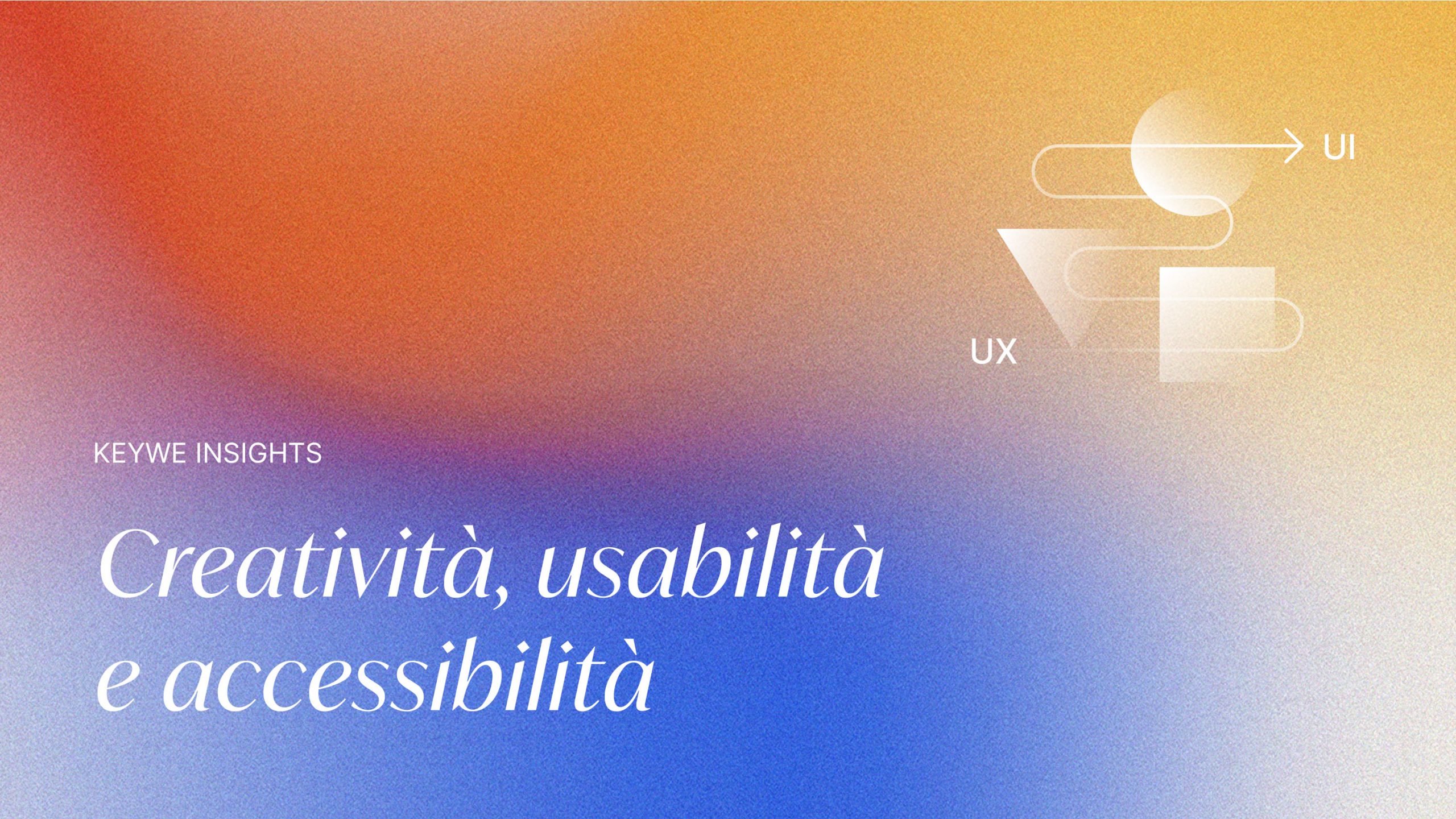
Creativity, usability and accessibility: how to create functional interfaces without losing authenticity.
What makes an interface truly memorable?
When we talk about design, we think of inventiveness, aesthetics and creativity. But the primary task of every designer is to create products that are intuitive and enjoyable to use.
Nielsen and Molich’s 10 heuristics provide guidelines for designing accessible and easy-to-navigate digital experiences. But there is a risk: following these rules to the letter can lead to standardisation, and many platforms end up looking alike.
So, how can you create a visually striking digital identity that also respects the principles of usability?
In this article, we discuss:
- What is meant by UX/UI Design
- Nielsen and Molich’s 10 heuristics in detail
- Our approach to design
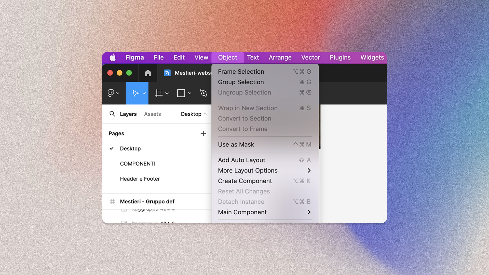
What is meant by UX/UI Design
Good UX/UI design determines the success of websites, apps and digital products. At the heart of every digital experience are people: their goals, their behaviour, their engagement.
UX Design
UX Design is short for User Experience Design. Its purpose is to create digital products that meet the real needs of those who use them, facilitating customer loyalty and, consequently, sales.
UI Design
UI Design stands for User Interface Design. This discipline creates and develops the graphical interface of digital products, such as websites or mobile applications. Its goal is to make interaction intuitive, effective and aesthetically pleasing.
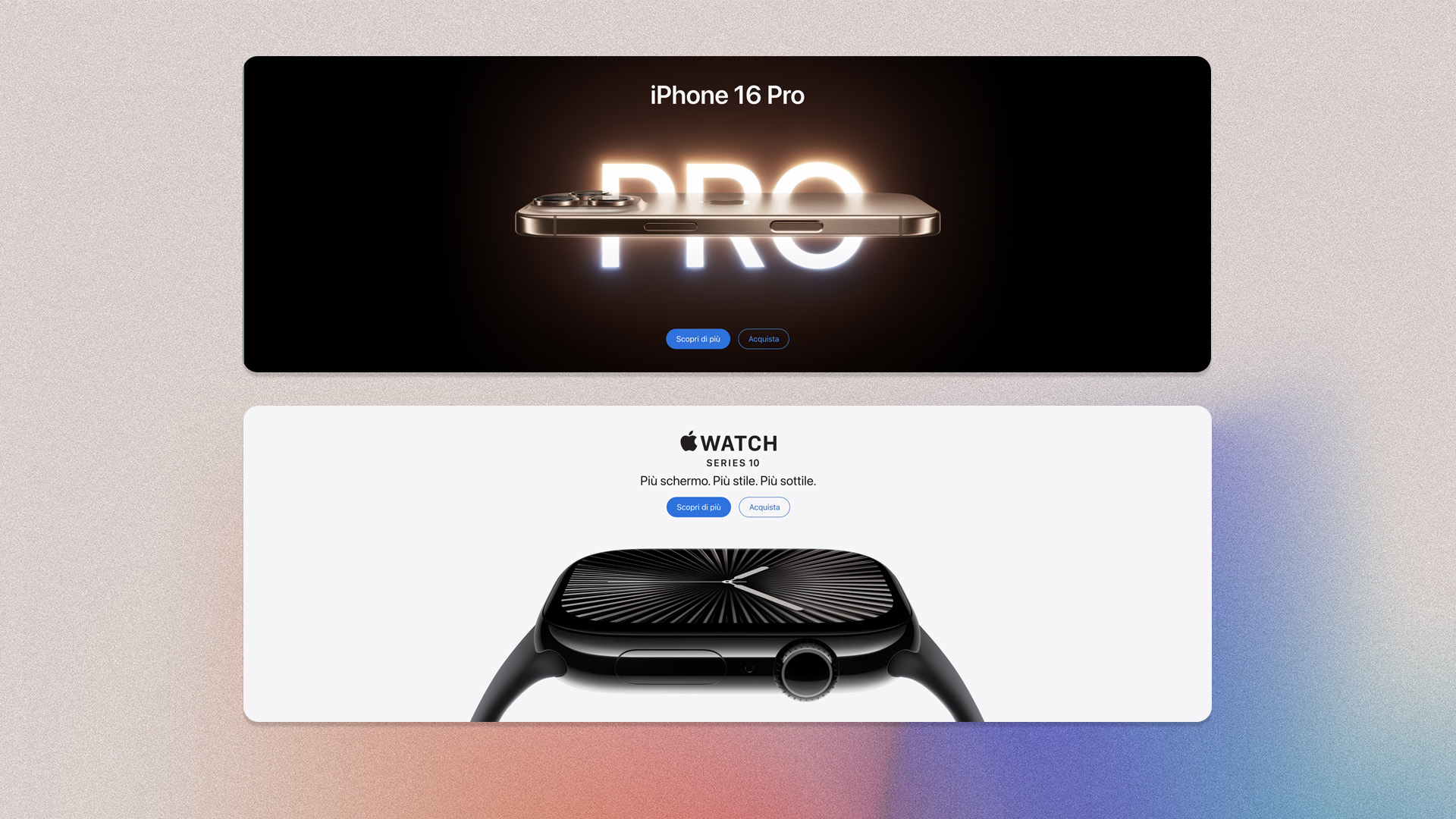
UI Kit – Best practice
User interface design kits consist of ready-to-use elements such as buttons, shapes, and icons. They serve as a visual library to kick-start the design process. Here are a few collections:
What are Nielsen and Molich's 10 heuristics
Formulated in the 1990s, Nielsen and Molich’s guidelines pave the way for creating interfaces that put usability first. UX/UI design continues to evolve, but these heuristics remain relevant for ensuring an optimal user experience.
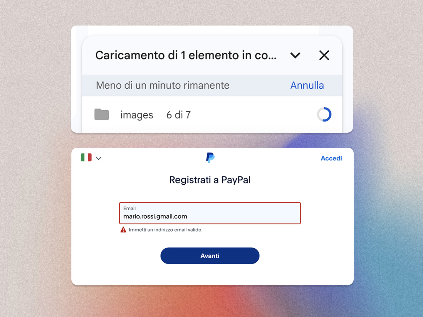
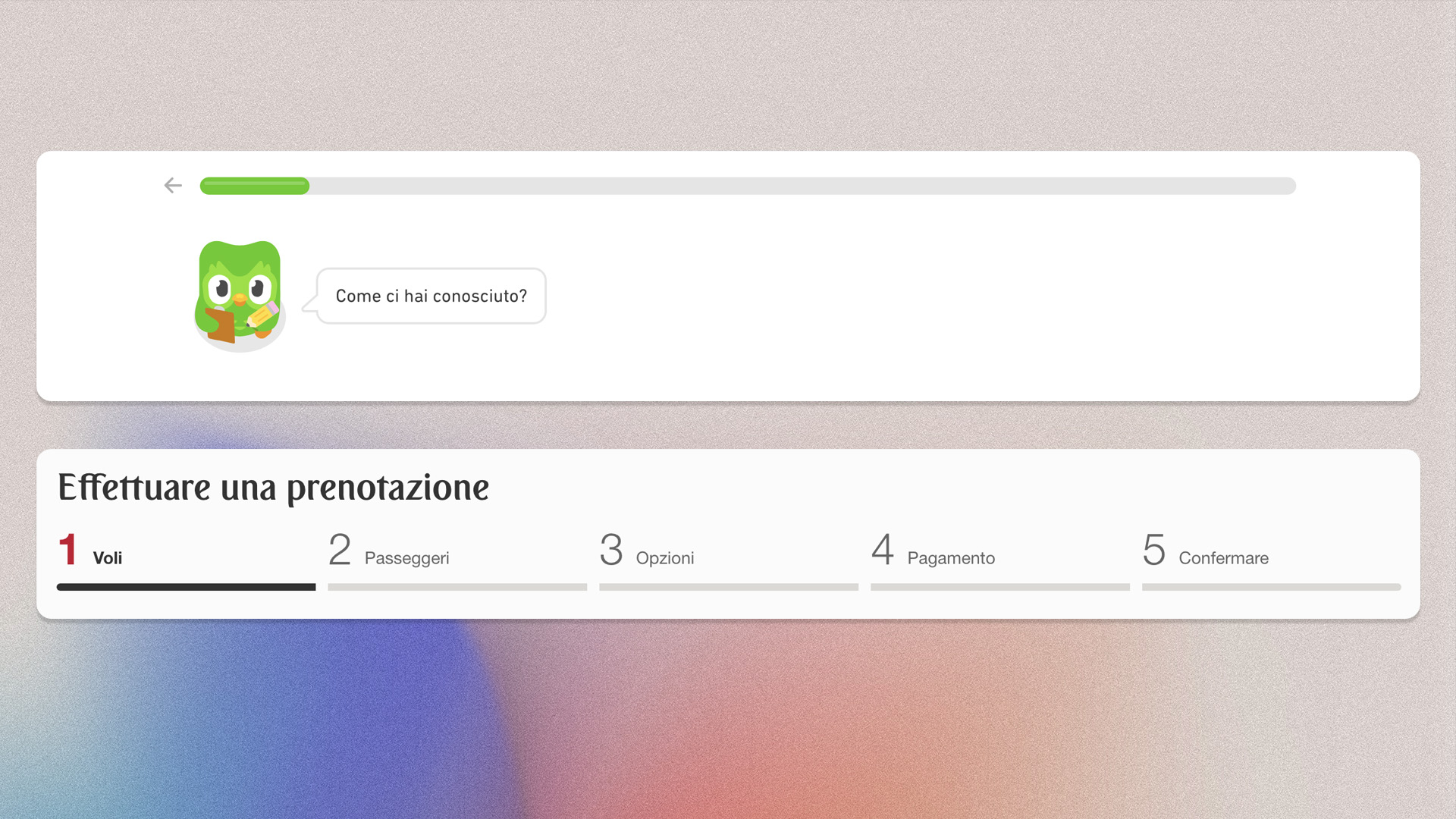
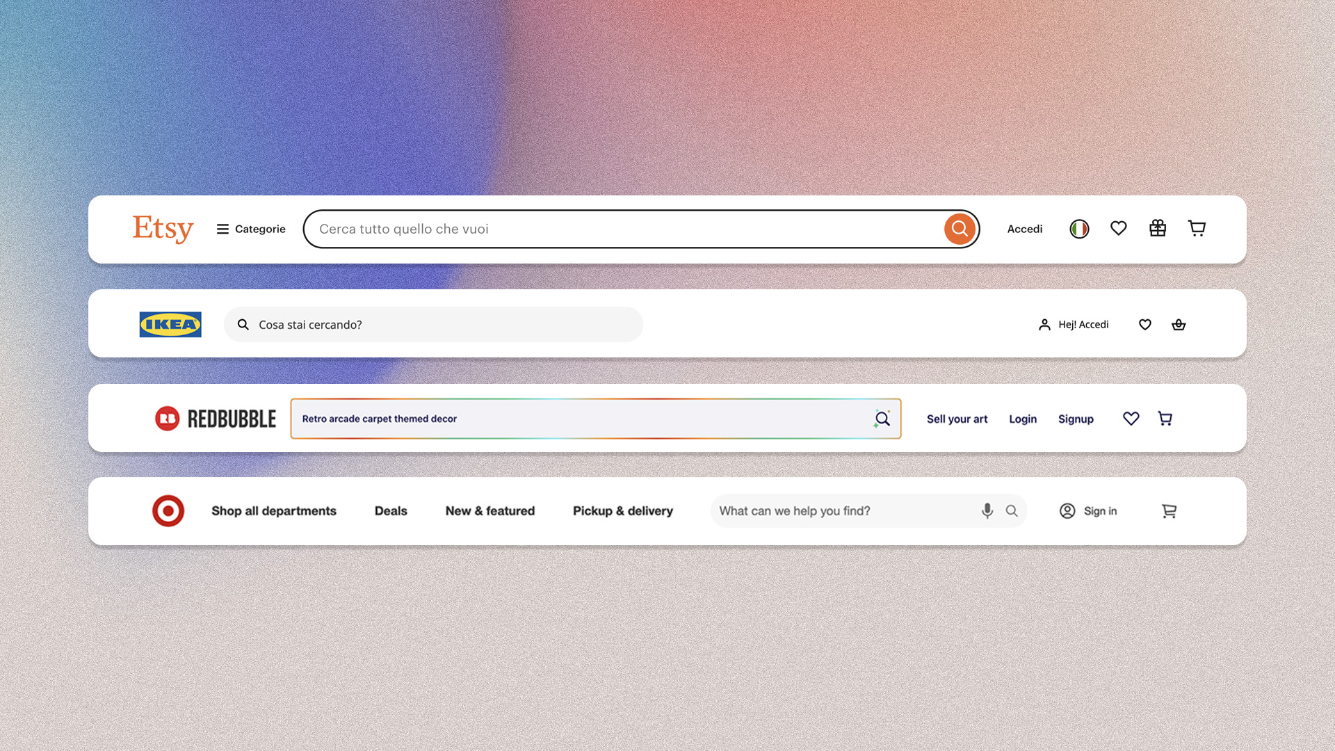
1. Visibility of system status
Users should always be informed about what is happening within the system with appropriate feedback within a reasonable time frame. Best practices:
- Progress indicators
- Notifications
- Status updates
The visible system status limits frustration and reassures users, builds trust, and promotes engagement.
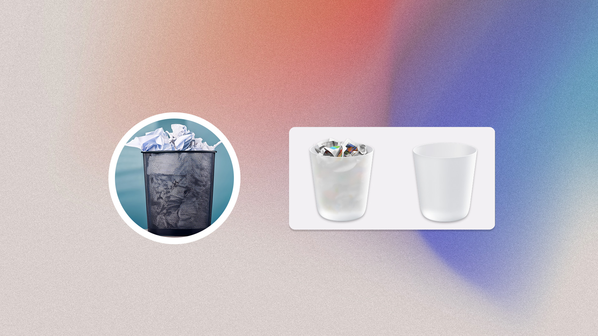
2. Match between the system and the real world
The system should reflect the real world, with easily recognisable languages and visual elements. This promotes intuitive use, reduces the learning curve and improves satisfaction. Best practices:
- Language: avoid technical jargon
- Real-world metaphors: use icons from the physical world
- Natural sequencing: favour logical sequencing
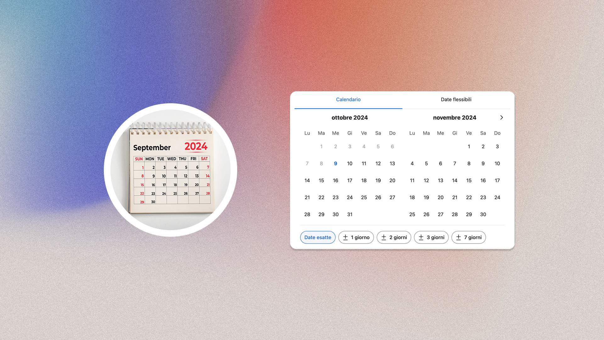
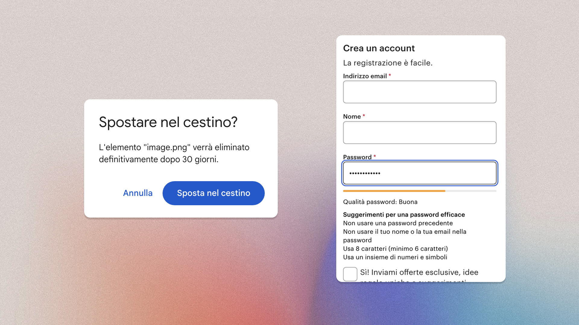
3.User control and freedom
Users should be able to easily undo incorrect choices and should never find themselves in irreversible situations. Best practices:
- Undo option: allow users to go back without restarting the entire process
- Clear and visible exit buttons
- Confirmation buttons to prevent accidental errors
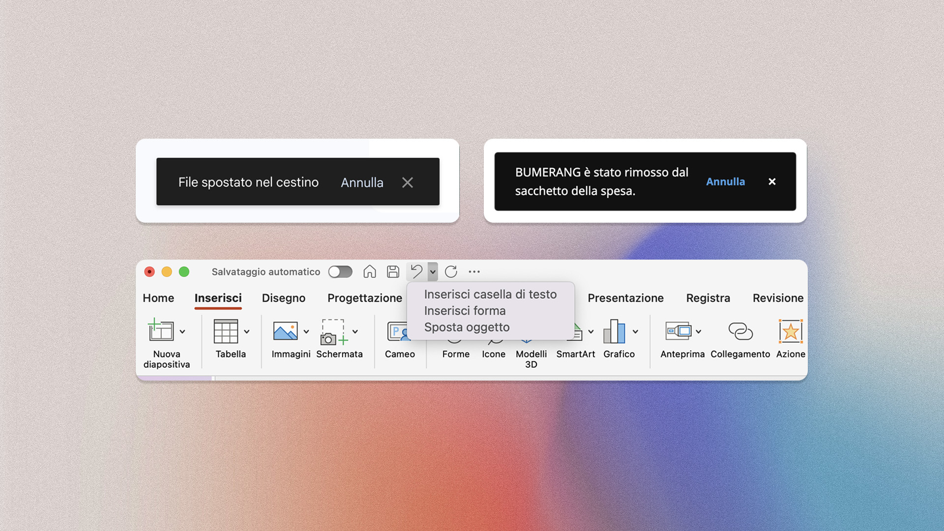
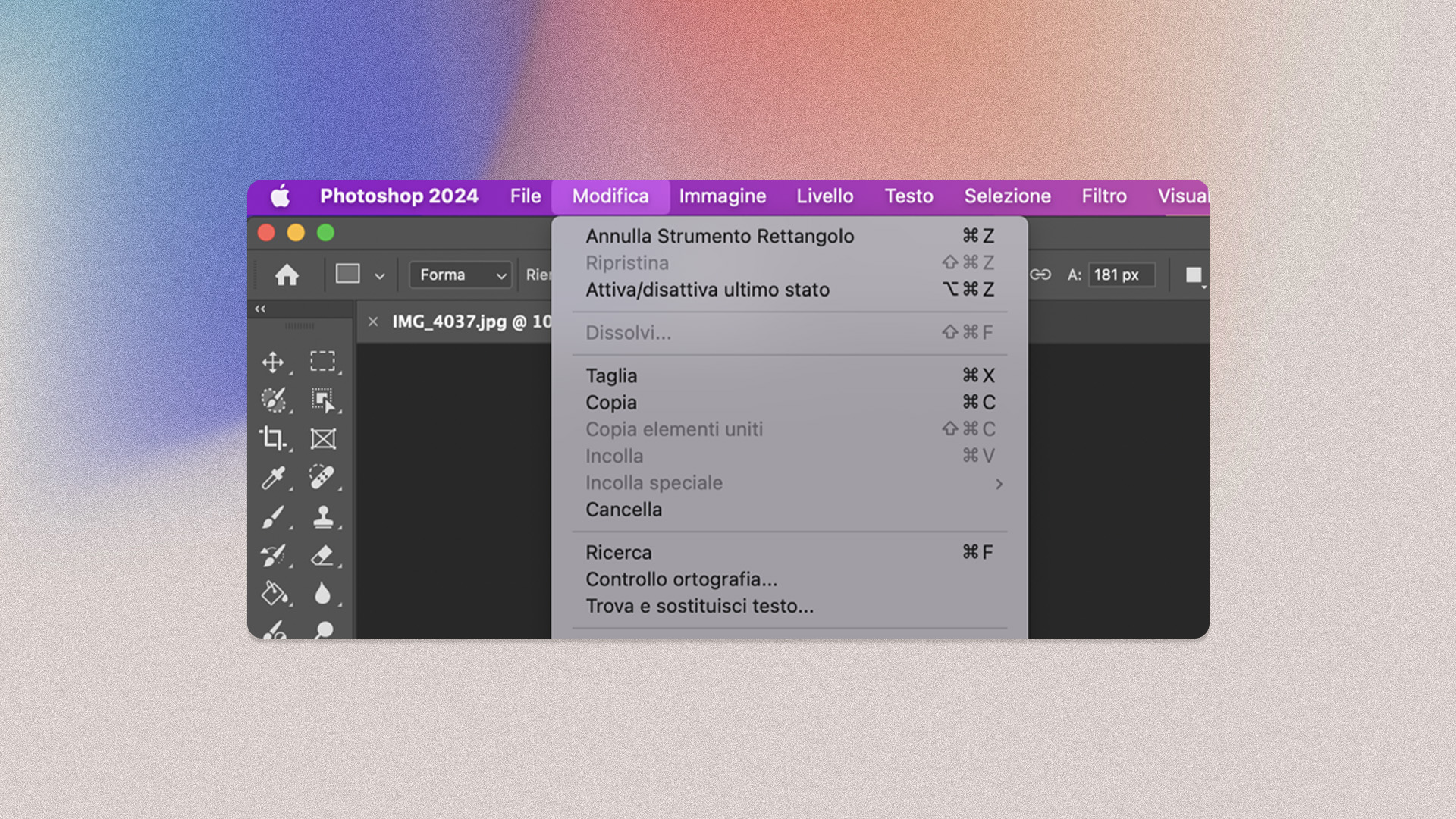
4. Consistency and standards
A consistent design uses recurring icons, terminology and behaviours. This creates a sense of reliability, reduces mental effort and facilitates learning of the interface. Best practices:
- Ensure visual consistency
- Use interaction patterns
- Adapt to platform conventions (iOS, Android, web)
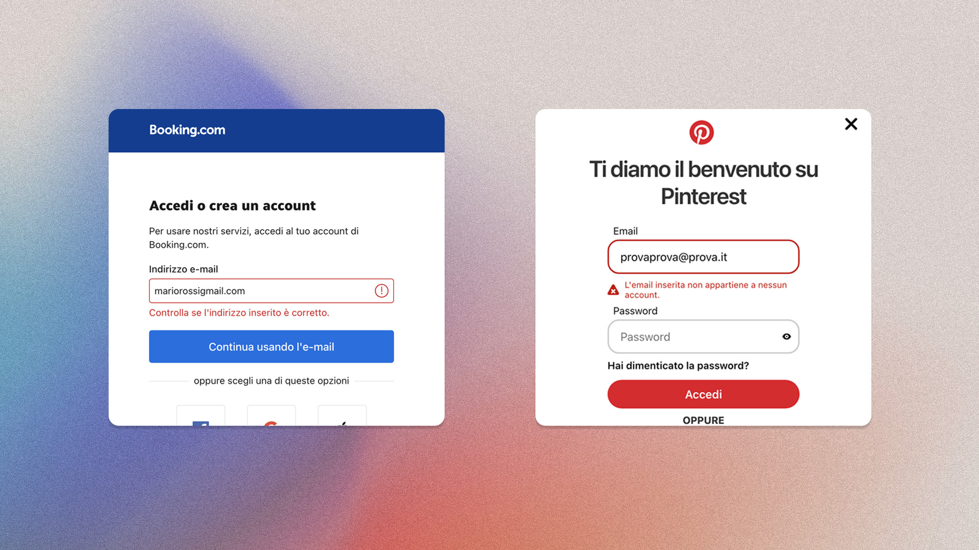
5. Error prevention
The system should always guide users through tasks, minimising the possibility of incorrect choices.
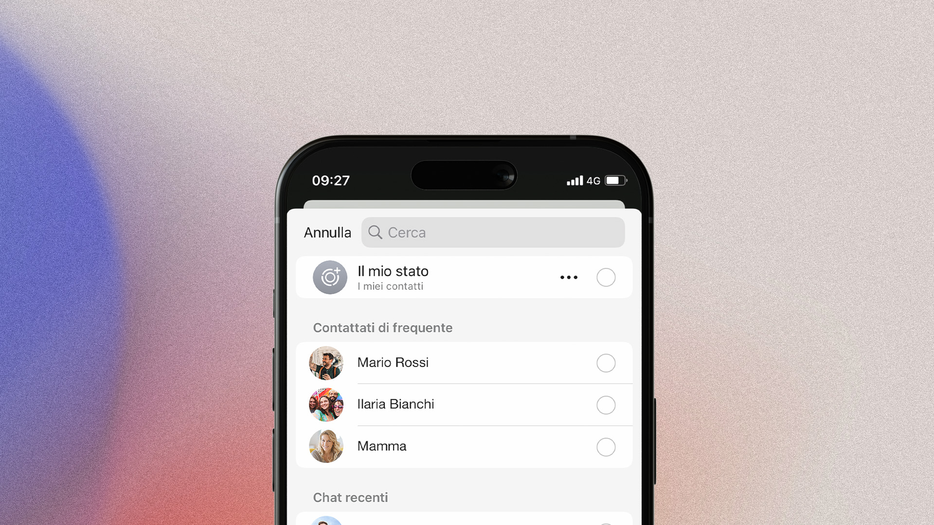
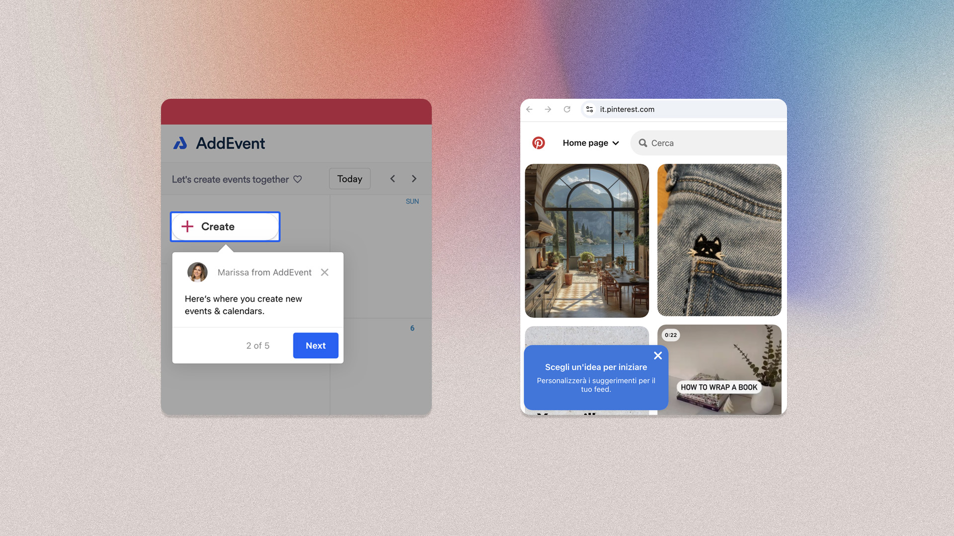
6. Recognition rather than recall
Information, options and possible actions should always be visible, reducing the user’s memory load. The ‘autocomplete’ mechanism found in many search engines – Google in particular – is a concrete example of this principle. Best practices:
- Suggestions
- Pre-filled forms
- Recent actions
7. Flexibility and efficiency of use
While novice users may prefer guided workflows, advanced users often seek quick ways to complete tasks. Examples include keyboard shortcuts, quick paths, customisation, and interface adjustments.
8. Aesthetic and minimalist design
Visual clutter makes it difficult to focus on core activities. Minimalist design avoids unnecessary elements and allows users to see what is essential. Best practices:
- Use ample white space to improve readability
- Highlight important information and hide less relevant information
- Minimise buttons, links, and page sections
9. Help users recognize, diagnose, and recover from errors
In the event of an error, users should be able to understand what went wrong and how to fix it. Clear, actionable error messages are essential to helping users recover quickly.
10. Help and Documentation
Although it is preferable that the system does not require any documentation, there are cases where this is necessary. Any information of this type should be easily recognisable and accessible.
Our approach to design
At KeyWe, design systems and user interface kits are valuable tools. We recognise their strengths and differences, and use them to build a cohesive design language.
Design System: tools and values
Our activities revolve around the Design System. A comprehensive source that encompasses all the components needed to design, create and develop a digital or printed product. It includes tangible and intangible elements:
- Tangible: tools for designers and developers, templates, components, guidelines.
- Intangible: brand values, mindset, shared beliefs and ways of working.
This system provides us with a framework within which to design creatively, ensuring that innovations remain usable and accessible over time.
Authenticity and long-term usability
Our mission is to create unique and memorable digital identities, always respecting usability and accessibility guidelines. We do not blindly follow current trends. These are constantly changing and often overlook people’s real needs. That is why we prioritise brand identity and long-term usability.
A consistent design takes into account certain essential elements:
- clear typography;
- intuitive navigation;
- user-friendly colour palette.
For us, these elements remain fundamental, even when we design with an eye on current trends. Authenticity helps to differentiate a product, whether physical or digital. Differentiating yourself means standing out and inspiring trust in the long term.
Balancing trends with timeless design principles
In some cases, ignoring trends in design could be counterproductive. Especially when a new practice becomes established and becomes the standard. Think of Responsive Design or motion-based interfaces. These innovations have proven to be much more than a visual choice, but functional improvements that optimise navigation.
Here are the challenges of design: redefining the boundaries of innovation, pushing professionals towards a new approach. At KeyWe, we experiment with new solutions by balancing current trends and usability principles. This requires a balance between aesthetics and adherence to design principles such as consistency, readability and accessibility.
Written by
Giulia